Picking the Perfect Color Palette for Every Room
I spent three hours last weekend staring at a tiny, overpriced swatch of “Greige” in my kitchen, paralyzed by the fear that it wouldn’t play nice with my mid-century sideboard. We’ve been sold this lie that you need a degree in interior design or a massive budget to get your house right, but honestly? Most of the “expert” rules about how to choose a color scheme are just noise designed to make you buy more expensive paint. You don’t need a complex mathematical formula or a dozen designer consultations to make a room feel cohesive; you just need a solid plan that doesn’t leave you second-guessing every single wall.
I’m not here to give you a lecture on color theory or show you a Pinterest board of rooms that don’t actually live in the real world. Instead, I’m going to give you the straight-talk version of how to pick colors that actually work with your furniture, your lighting, and your sanity. We’re going to strip away the fluff and focus on a few practical, repeatable steps that will help you get it done without the mental exhaustion.
Table of Contents
Mastering Color Theory for Interior Design Without the Headache
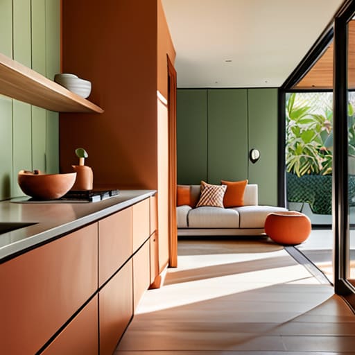
Look, you don’t need a degree in fine arts to understand color theory for interior design; you just need to understand how a room makes you feel. I used to get bogged down in the technicalities, but after years of managing high-stakes projects, I’ve learned that simplicity is your best friend. Think of it this way: colors have a job to do. Some are meant to energize a kitchen, while others are there to help you decompress in the bedroom.
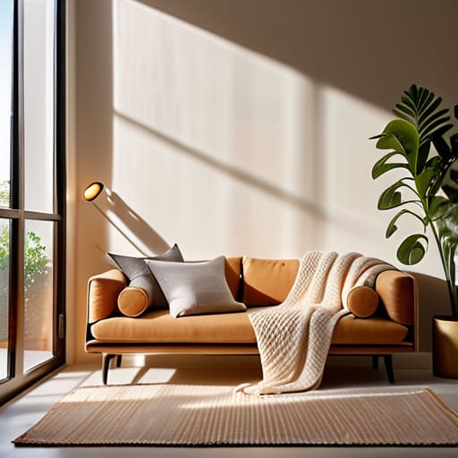
If you’re feeling stuck, start by deciding on your vibe: are we going for cozy and snug, or bright and airy? This is where the battle of warm vs cool color tones comes into play. Warm tones—think terracottas and soft ambers—bring that immediate sense of comfort, whereas cool tones like sage or slate blue can make a cramped room feel much more expansive. Once you’ve picked your “anchor” color, don’t stress about finding a dozen others. Just look for a few complementary color combinations that play well together, and you’ll have a space that feels intentional rather than accidental.
Choosing Between Warm vs Cool Color Tones for Real Life
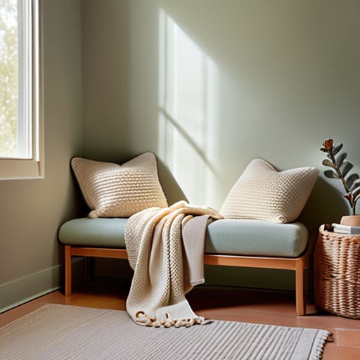
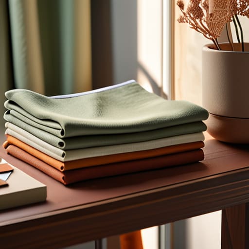
Here is the deal with warm versus cool tones: it isn’t just about what looks pretty in a showroom; it’s about how you actually want to feel when you walk through your front door after a long day. I’ve learned through years of rearranging my own living spaces that temperature dictates the energy of a room. Warm tones—think soft terracottas, buttery creams, or sandy beiges—tend to make a space feel cozy and inviting. They are perfect for a den where you want to curl up with a book. On the flip side, cool tones like soft blues, sage greens, or crisp greys can make a room feel airy and calm, which is a lifesaver in a cramped bathroom or a high-stress home office.
When you’re deciding, don’t get paralyzed by every single swatch in the hardware store. Instead, look at the natural light in your house. If your windows face north and the light is always a bit bluish and dim, leaning into warm vs cool color tones becomes a strategic move to keep the room from feeling like a cave. My rule of thumb? Use the psychology of color in home decor to your advantage. If you want a space to feel energetic, go warm; if you need it to feel peaceful, go cool. Just pick a direction and commit.
Five Ways to Pick a Palette Without Losing Your Mind
- Start with one piece you actually love. Whether it’s that vintage teak sideboard I spent three weekends refinishing or a rug that ties the room together, let that one item dictate the rest of the colors. Don’t try to build a scheme from scratch when the foundation is already sitting right in front of you.
- Use the 60-30-10 rule to keep things balanced. I swear by this for avoiding that “cluttered” feeling. Aim for 60% of a dominant color (usually your walls), 30% of a secondary color (upholstery or curtains), and 10% for an accent color (pillows or decor). It keeps the room from feeling like a chaotic patchwork quilt.
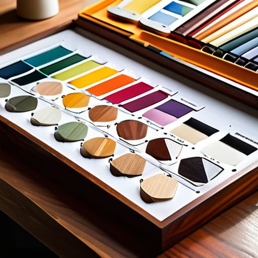
- Test your colors in the actual light of the room. A swatch might look like a sophisticated sage in the bright light of the hardware store, but once you put it on a north-facing wall in your living room, it might look like a muddy swamp. Grab a few samples, paint them on large pieces of cardstock, and move them around throughout the day.
- Don’t forget about your “fixed” elements. Before you fall in love with a navy blue palette, look at your flooring, your kitchen countertops, or even your fireplace stone. These are the things you aren’t going to change next week, so your color scheme needs to play nice with them, not fight them.
- Limit your palette to avoid visual noise. One of the biggest mistakes I see is trying to squeeze too many colors into one space. If you have too many competing hues, your brain never gets a chance to rest. Stick to a tight group of colors that share a similar undertone to keep the vibe calm and intentional.
The Bottom Line: Keep It Simple
Stop trying to match every single piece of furniture you own; instead, pick a cohesive base of neutrals and use one or two accent colors to tie the room together.
Test your paint colors in your actual house at different times of the day before you commit—lighting changes everything, and what looks great in a showroom might feel gloomy in your living room.
Don’t aim for perfection or a “magazine look”—aim for a palette that feels calm and makes your daily routine a little easier to manage.
Making the Final Call
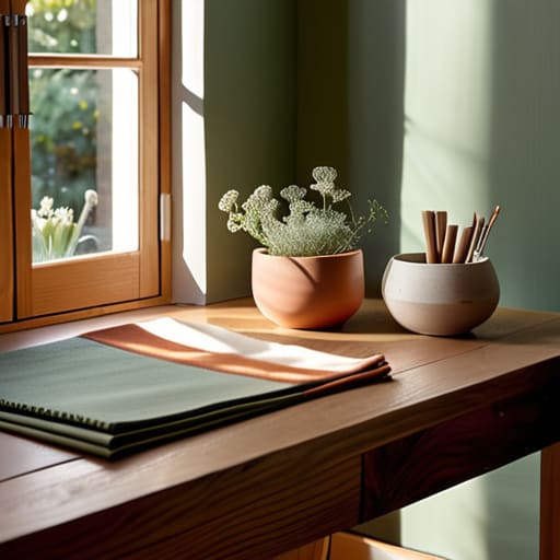
At the end of the day, picking a color scheme isn’t about following every rule in a textbook; it’s about understanding how your space actually functions. We’ve talked about the heavy lifting—balancing your undertones, deciding between warm and cool vibes, and using color theory to create flow rather than chaos. Remember, you don’t need a professional designer to tell you that a room feels “off.” If you’ve leaned into a palette that honors your lighting and your lifestyle, you’ve already done the hard part. Stop chasing perfection and start focusing on consistency and intention. Once you have those core colors set, the rest of the decorating becomes a lot less daunting and a lot more intuitive.
I know how it feels to stare at a dozen different paint swatches and feel completely paralyzed by the fear of making a mistake. But here is the truth from someone who has spent way too many weekends staring at walls: you can always change your mind. If a shade feels too heavy or a combination feels too loud, you can repaint, swap out a rug, or add a few textured pillows to shift the energy. Your home is a living, breathing project, not a museum piece. Just pick a direction and move forward. The goal isn’t to create a Pinterest-perfect showroom; it’s to build a space that actually works for you.
Frequently Asked Questions
How many different colors can I actually use before the room starts looking like a circus?
Look, I’ve seen enough “maximalist” rooms to know that there’s a fine line between a curated space and a headache. Stick to the 60-30-10 rule. Use your dominant color for 60% of the room, a secondary for 30%, and save that bold, “circus” color for the final 10% as an accent. If you start adding a fourth or fifth major hue, you aren’t designing; you’re just decorating a carnival. Keep it simple.
Should I be picking colors based on my furniture or the walls first?
Look, I get the paralysis. You’re staring at that vintage sideboard you just refinished, wondering if it’s going to clash with everything. Here’s my rule of thumb: start with your “anchors.” Those are your big, non-negotiable pieces—your sofa, your rug, or that heirloom dining table. It’s much easier to find a paint swatch that complements a velvet navy couch than it is to find a couch that matches a specific shade of sage green. Pick your anchors, then build the walls around them.
What do I do if I pick a paint color and realize it looks completely different once it's actually on my walls?
Deep breaths—it happens to the best of us. First, stop panicking; lighting changes everything. Before you grab the rollers, grab a few more samples and paint them on different walls to see how the sun hits them at noon versus 7 PM. If you’ve already committed and hate it, don’t sweat the cost. You can always tint the existing color with a bit of darker pigment to shift the hue, or just embrace the “learning experience” and repaint.